반응형
*무지개 만들기
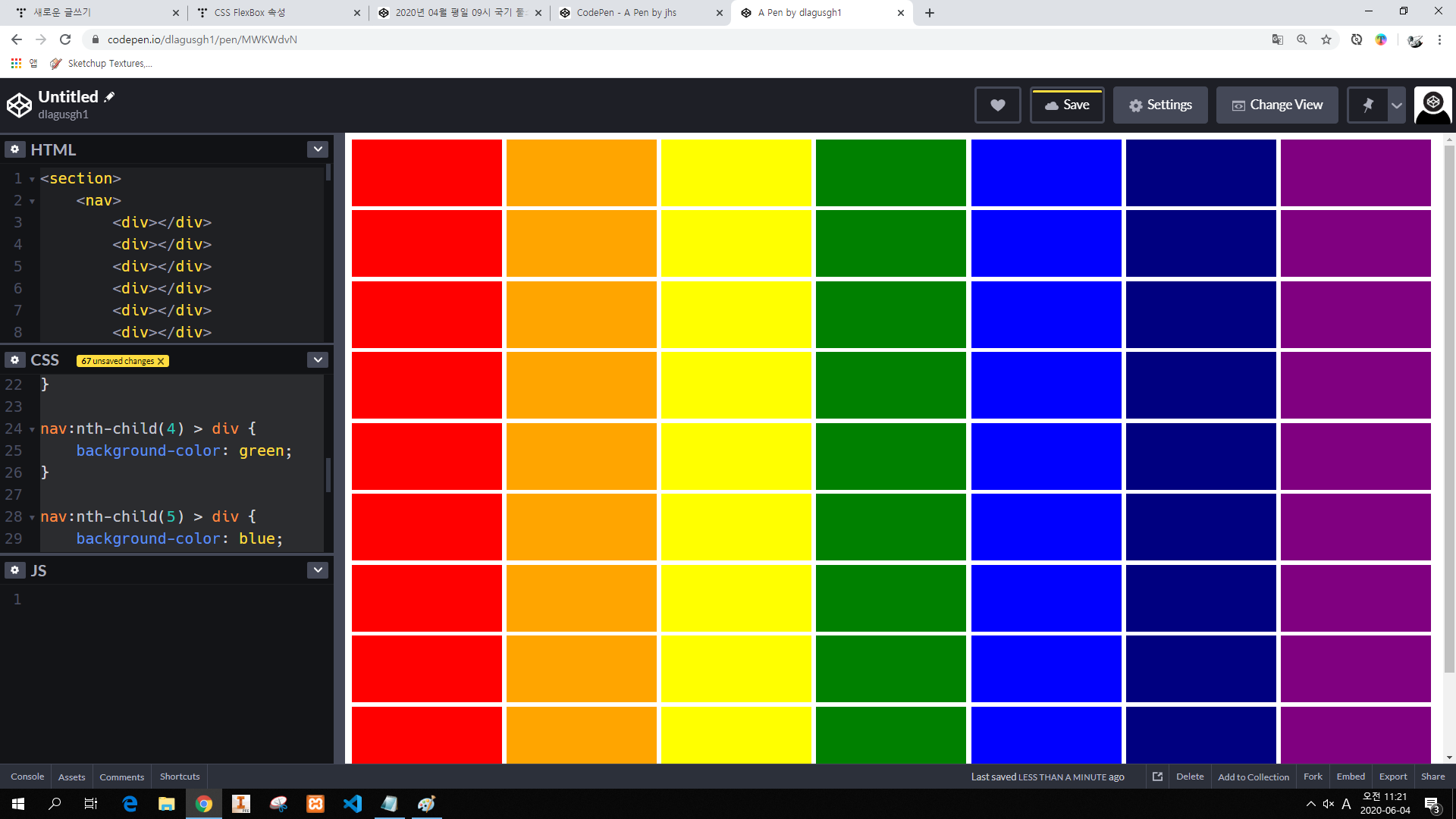
// HTML
<nav>
    <div></div>
    <div></div>
    <div></div>
    <div></div>
    <div></div>
    <div></div>
    <div></div>
    <div></div>
    <div></div>
    <div></div>
    <div></div>
    <div></div>
    <div></div>
    <div></div>
    <div></div>
    <div></div>
    <div></div>
    <div></div>
    <div></div>
    <div></div>
    <div></div>
    <div></div>
    <div></div>
    <div></div>
    <div></div>
    <div></div>
    <div></div>
    <div></div>
    <div></div>
    <div></div>
    <div></div>
    <div></div>
    <div></div>
    <div></div>
    <div></div>
    <div></div>
    <div></div>
    <div></div>
    <div></div>
    <div></div>
    <div></div>
    <div></div>
    <div></div>
    <div></div>
    <div></div>
    <div></div>
    <div></div>
    <div></div>
    <div></div>
    <div></div>
    <div></div>
    <div></div>
    <div></div>
    <div></div>
    <div></div>
    <div></div>
    <div></div>
    <div></div>
    <div></div>
    <div></div>
    <div></div>
    <div></div>
    <div></div>
    <div></div>
    <div></div>
    <div></div>
    <div></div>
    <div></div>
    <div></div>
    <div></div>
    <div></div>
    <div></div>
    <div></div>
    <div></div>
    <div></div>
    <div></div>
    <div></div>
    <div></div>
    <div></div>
    <div></div>
    <div></div>
    <div></div>
    <div></div>
    <div></div>
    <div></div>
    <div></div>
    <div></div>
    <div></div>
    <div></div>
    <div></div>
    <div></div>
    <div></div>
    <div></div>
    <div></div>
    <div></div>
    <div></div>
    <div></div>
    <div></div>
    <div></div>
    <div></div>
</nav>

// CSS
nav {
    text-align: center;
}
nav > div {
    background-color: red;
    width: 13%;
    height: 100px;
    display: inline-block;
}

nav > div:nth-child(7n + 2) {
    background-color: orange;
}

nav > div:nth-child(7n + 3) {
    background-color: yellow;
}

nav > div:nth-child(7n + 4) {
    background-color: green;
}

nav > div:nth-child(7n + 5) {
    background-color: blue;
}

nav > div:nth-child(7n + 6) {
    background-color: navy;
}

nav > div:nth-child(7n + 7) {
    background-color: purple;
}
*이미지 배치 ( 엘리먼트 4개만 사용하여 )
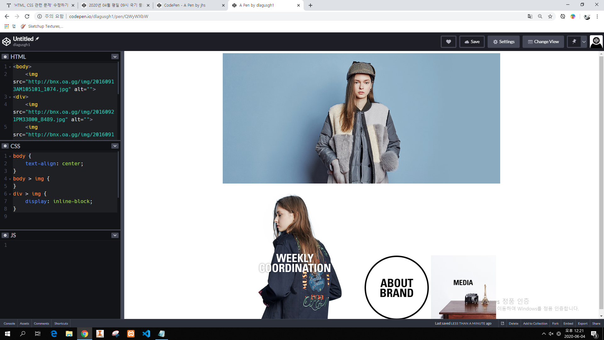
// HTML
<img src="http://bnx.oa.gg/img/20160913AM105101_1074.jpg" alt="">
<img src="http://bnx.oa.gg/img/20160921PM33800_8489.jpg" alt="">
<img src="http://bnx.oa.gg/img/20160913PM122312_9304.jpg" alt="">
<img src="http://bnx.oa.gg/img/20160913PM122323_2917.jpg" alt="">


// CSS
body {
    text-align:center;
}
img:nth-child(1) {
    display:block;
    margin-left: auto;
    margin-right: auto;
}
*메뉴 만들기

// HTML
<h2>메뉴 예시</h>

<!-- 메뉴 박스 -->
<nav>
    <!-- 메뉴 -->
    <section>
        <!-- 메뉴 아이템 -->
        <div>
            <!-- 메뉴 아이템 텍스트(클릭하면 이동해야 하므로 a태그 사용)-->
            <a href="#">Home</a>
        </div>
        <div>
            <a href="#">Tutorials</a>
        </div>
        <div>
            <a href="#">Articles</a>
        </div>
        <div>
            <a href="#">Inspiration</a>
        </div>
    </section>
</nav>


// CSS
/* 노말라이즈 항상 먼저 진행*/
/* 노말라이즈 시작 */
body, h2 {
    margin: 0;
}
a {
    color:inherit;
    text-decoration: none;
}
/* 노말라이즈 끝 */
/* 커스텀 */
nav {
    text-align: center;
}
nav > section {
    background-color:#afafaf;
    display: inline-block;
    text-align:center;
    border-radius: 10px;
    padding: 0 20px;
}
nav > section > div {
    display: inline-block;
}
nav > section > div > a {
    padding: 20px;
    display: block;
    font-weight: bold;
}

nav > section > div:hover > a {
    background-color: black;
    color: white;
}
반응형
'프로그래밍 > HTML, CSS, JSP, 서블릿' 카테고리의 다른 글
| HTML, CSS 연습문제(메뉴 만들기, 인접동생 숨기기/표시, position) (0) | 2020.06.05 |
|---|---|
| HTML, CSS 관련 기본사항2 (0) | 2020.06.04 |
| 이미지 (img) 삽입, margin, padding, lorem, nth-child (0) | 2020.06.04 |
| 글자 효과 제거 (text-decoration) (0) | 2020.06.03 |
| 공백  , br (0) | 2020.06.03 |