반응형

*1차메뉴/2차메뉴/3차메뉴/서브메뉴 구분

// 메뉴 박스
<nav class="menu-box-1">
	// 1차 메뉴 
	<ul>
		// 1차 메뉴 아이템
		<li>
			// 1차 메뉴 아이템 텍스트
			<a href="#">동물</a>
			// 2차 메뉴
			<ul>
				// 2차 메뉴 아이템
				<li>
					// 2차 메뉴 아이템 텍스트
					<a href="#">포유류</a>
					// 3차 메뉴
					<ul>
						// 3차 메뉴 아이템
						<li>
							// 3차 메뉴 아이템 텍스트
							<a href="#">사자</a>
						</li>
						<li>
							<a href="#">호랑이</a>
						</li>
					</ul>
				</li>
				<li><a href="#">조류</a></li>
			</ul>
		</li>
		<li>
			<a href="#">식물</a>
			<ul>
				<li><a href="#">과일</a></li>
				<li><a href="#">야체</a></li>
			</ul>
		</li>
	</ul>
</nav>

1. 1차 메뉴

- .menu-box-1 > ul  : 1차 메뉴를 선택하겠다는 것.

- .menu-box-1 > ul > li : 1차 메뉴 아이템.

- .menu-box-1 > ul > li > a : 1차 메뉴 아이템 텍스트.


2. 2차 메뉴

- .menu-box-1 > ul > li > ul : 2차 메뉴

- .menu-box-1 > ul > li > ul > li : 2차 메뉴 아이템

- .menu-box-1 > ul > li > ul > li > a : 2차 메뉴 아이템 텍스트

3. 3차 메뉴

- .menu-box-1 > ul > li > ul > li > ul : 3차 메뉴

- .menu-box-1 > ul > li > ul > li > ul > li : 3차 메뉴 아이템

- .menu-box-1 > ul > li > ul > li > ul > li > a : 3차 메뉴 아이템 텍스트


- .menu-box-1 > ul ul : 1차 메뉴 안에 있는 메뉴 들을 모두 선택(서브 메뉴)

( 서브메뉴 : 특정 메뉴에 마우스 올릴 시 부가적으로 나오는 메뉴 같은 것 )

반응형
반응형

*z-index

- position: absolute 시 겹쳐진 대상들 간의 우선순위를 정하는 것.

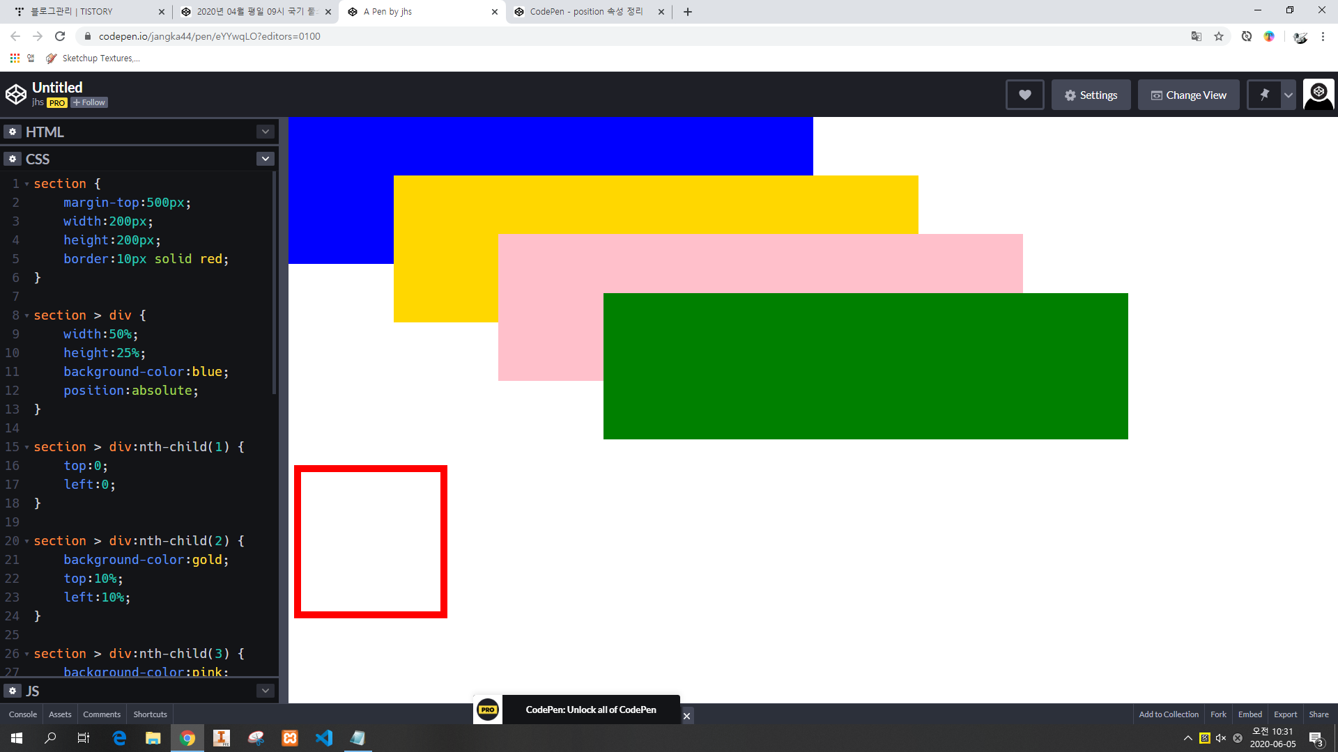
- z-index 값에 따라 겹쳐진 대상이 맨 위 ~ 맨 아래에 위치하게 된다. (숫자가 클 수록 위에 위치하게 된다.)

// HTML
<section>
    <div></div>
    <div></div>
    <div></div>
    <div></div>
</section>


// CSS
section {
    margin-top:500px;
    width:200px;
    height:200px;
    border:10px solid red;
}

section > div {
    width:50%;
    height:25%;
    background-color:blue;
    position:absolute;
    /* 4등 : z-index 도 없고 맨 처음 등장한 유령이다. */
}

section > div:nth-child(1) {
    top:0;
    left:0;
}

section > div:nth-child(2) {
    background-color:gold;
    top:10%;
    left:10%;
    z-index:2; /* 경쟁자 중에서 2가 가장 큰 수 이기 때문에 맨 위(1등)에 위치한다. */
}

section > div:nth-child(3) {
    background-color:pink;    
    top:20%;
    left:20%;
    z-index:1; /* 경쟁자 중에서 2 다음으로 높은 수(1) 이기 때문에 2등이 된다. */
}

section > div:nth-child(4) {
    background-color:green;    
    top:30%;
    left:30%;
    /* z-index가 없으면 기본적으로 경쟁에서 밀린다. 그래서 3등이다. */
}


*white-space:nowrap;

- 절대 줄바꿈 금지 

// HTML
<div>
    Lorem, ipsum dolor sit amet consectetur adipisicing elit. Cupiditate veniam cum, corrupti praesentium sit, atque ad optio inventore omnis quod nostrum amet eveniet? Assumenda labore accusamus soluta adipisci, aliquam veniam?
</div>


// CSS
div {
    padding:10px;
    font-size:2rem;
    width:1000px;
    margin:0 auto;
    background-color:red;
    /* 절대 줄바꿈 금지 */
    white-space:nowrap;
}


*스크롤바

- overflow-x:auto : 스크롤 바 자동 생성

- overflow-x:scroll : 스크롤 바 무조건 생성


* 텍스트 관련

- overflow-x:hidden : 넘치는 내용 무조건 숨김

- text-overflow:ellipsis : 넘치는 텍스트 ... 으로 표시


반응형
반응형

1. 클래스 선택자

- 중복되는 항목에 대해 CSS 작업 시 작업을 용이하게 하기 위해 태그에 클래스를 부여하여 CSS 작업 시 부여된 이름을 통해 작업이 진행될 수 이도록 한 것.

- <div class="a"></div> 인 경우 / CSS에서 해당 항목 호출하여 작업 시 .a { } 로 진행.

- 엘리먼트의 별명이 2개인 경우 / CSS에서 해당 항목 호출하여 작업 시 .a.aa { } 식으로 진행.

// HTML
<div class="a"></div>
<div class="b"></div>
<div class="c"></div>
<!-- 아래 엘러먼트는 별명이 2개 입니다.(.d, .black) -->
<div class="d black"></div>
<!-- 아래 엘러먼트는 별명이 2개 입니다.(.b, .black) -->
<div class="b black"></div>
<div class="f"></div>


// CSS
body {
    text-align:center;
}

div {
    width:30%;
    display:inline-block;
    height:100px;
    background-color:red;
    margin:10px;
}

/* div 이면서 동시에 a 클래스를 가지고 있는 */
div.a {
    background-color:green;
}

/* 클래스 b 인 엘리먼트 */
.b {
    background-color:blue;
}

.black {
    background-color:black;
}

/* d 라는 클래스를 가진 동시에 black 이라는 클래스도 가진 엘리먼트 */
.d.black {
    background-color:#565656;
}


2. ul, ol, li

- ul (unordered list) : 목록을 의미. (목록을 만들 때 무조건 사용, li와 함께 사용)

- ol (ordered list) : 목록을 의미. (순서가 중요한 리스트인 경우 사용, li와 함께 사용)

- li (list) : 항목을 의미.

ul - li 사용 시
ol - li 사용 시 (순서 존재)


3. 리스트 스타일 초기화

- list-style: none; 설정 시 리스트 앞에 표시되었던 기호가 사라진다.


4. position 속성

- absolute, fixed : 너비가 최대한 줄어 든다, 유령화/유령의 집화, 겹치는게 가능하다, top/left/bottom/right 이동가능.

- relative : 너비 유지, 유령의 집화,  겹치기 불 가능.

- static : 너비 유지, 사람화, 겹치기 불 가능.

반응형
반응형

*메뉴 만들기-1

상단 메뉴박스

// HTML
<!-- 메뉴 박스 -->
<nav>
    <!-- 메뉴 -->
    <section>
        <!-- 메뉴 아이템 -->
        <div>
            <!-- 메뉴 텍스트 -->
            <a href="#">메뉴 아이템 1</a>
        </div>
        <div>
            <a href="#">메뉴 아이템 2</a>
        </div>
        <div>
            <a href="#">메뉴 아이템 3</a>
        </div>
        <div>
            <a href="#">메뉴 아이템 4</a>
        </div>
    </section>
</nav>


// CSS
/*노멀라이즈 시작*/
body {
    margin: 0;
}
a {
    color:inherit;
    text-decoration:none;
}
/*노멀라이즈 끝*/

/*커스텀*/
nav {
    text-align: center;
    margin-top: 10px;
}
nav > section {
    background-color: #9995;
    display: inline-block;
    font-weight: bold;
    text-align: center;
    padding: 0 10px;
    border-radius: 10px;
}
nav > section > div {
    display: inline-block;
}
nav > section > div > a {
    display: block;
    padding: 15px;
}
nav > section > div:hover > a {
    background-color: black;
    color: white;
}

*메뉴 만들기-2

// HTML
<h1>메뉴 연습</h1>
<nav class="menu-box-1">
    <ul>
        <li><a href="#">1차 메뉴 아이템 1</a></li>
        <li><a href="#">1차 메뉴 아이템 2</a></li>
        <li><a href="#">1차 메뉴 아이템 3</a></li>
        <li><a href="#">1차 메뉴 아이템 4</a></li>
    </ul>
</nav>


// CSS
body, ul, li {
    padding: 0;
    margin: 0;
    list-style: none;
}
a {
    color: inherit;
    text-decoration: none;
}
.menu-box-1 {
    background-color:red;
    text-align:center;
}
.menu-box-1 > ul {
  display: inline-block;
  background-color: #afafaf;
  font-weight: bold;
  border-radius: 10px;
  padding: 0 10px;
}
.menu-box-1 > ul > li {
  display: inline-block;
}
.menu-box-1 > ul > li > a {
  display: block;
  padding: 15px;
  background-color: pink;
}
.menu-box-1 > ul > li:hover > a {
  background-color: black;
  color: white;
}


*인접동생 숨기기/ 마우스 올리면 표시

- + 사용하여 인접 동생 숨기기 / 표시 진행

마우스를 버튼에 올리면 숨겨져있던 인접동생인 안녕이 표시된다.

// HTML
<a href="#">버튼</a>
<div>안녕</div>
<div>잘가</div>


// CSS
a + div {
    display: none;
}
a:hover + div {
    display: block;
}


*position 이용한 문제

1. 화면 4등분

// HTML
<h1>완료 : 화면의 좌측 하단을 붉은색으로 채워주세요.</h1>
<h1>요구 : 화면의 우측 하단을 골드색으로 채워주세요.</h1>

<section>
    <div></div>
    <div></div>
    <div></div>
    <div></div>
</section>


// CSS
section>div {
    position:absolute;
    width:50%;
    height:50%;
}

/* section 의 자식인 div 이면서 1번째 자식인 엘리먼트 */
/* `section>div:first-child` 와 `section>div:nth-child(1)` 는 같은 뜻 입니다. */
section>div:first-child {
    /* y 좌표 */
    top:0;
    /* x 좌표 */
    left:0;
    background-color:black;
}

/* section 의 자식인 div 이면서 2번째 자식인 엘리먼트 */
section>div:nth-child(2) {
    /* y 좌표 */
    top:0;
    /* x 좌표 */
    left:50%;
    background-color:green;
}

/* section 의 자식인 div 이면서 뒤에서 2번째 자식인 엘리먼트 */
section>div:nth-last-child(2) {
    /* y 좌표 */
    top:50%;
    /* x 좌표 */
    left:0%;
    background-color:red;
}
section>div:nth-child(4) {
    /* y 좌표 */
    bottom:0%;
    /* x 좌표 */
    right:0%;
    background-color:gold;
}


2. 화면 3등분

// HTML
<section>
    <div></div>
    <div></div>
    <div></div>
</section>


// CSS
section > div {
    position:absolute;
    width:33.3333%;
    height:100%;
    background-color:red;
}

section > div:nth-child(1) {
    top:0;
    left:0;
}

section > div:nth-child(2) {
    top:0;
    left:33.3333%;
    background-color:green;
}

section > div:nth-child(3) {
    top:0;
    left:66.6666%;
    background-color:black;
}


3. 화면 9등분

// HTML
<h1>요구 : 화면을 3*3 으로 나눠서 색을 칠해주세요.</h1>

<section>
    <div></div>
    <div></div>
    <div></div>
    <div></div>
    <div></div>
    <div></div>
    <div></div>
    <div></div>
    <div></div>
</section>


// CSS
section > div {
    position:absolute;
    width: 33.3333%;
    height: 33.3333%;
}
section > div:nth-child(1) {
    background-color: red;
    width: 33.3333%;
    height: 33.3333%;
    top: 0%;
    left: 0%;
}
section > div:nth-child(2) {
    background-color: blue;
    width: 33.3333%;
    height: 33.3333%;
    top: 0%;
    left: 33.3333%;
}
section > div:nth-child(3) {
    background-color: black;
    width: 33.3333%;
    height: 33.3333%;
    top: 0%;
    right: 0%;
}
section > div:nth-child(4) {
    background-color: gray;
    width: 33.3333%;
    height: 33.3333%;
    top: 33.3333%;
    left: 0%;
}
section > div:nth-child(5) {
    background-color: pink;
    width: 33.3333%;
    height: 33.3333%;
    top: 33.3333%;
    left: 33.3333%;
}
section > div:nth-child(6) {
    background-color: green;
    width: 33.3333%;
    height: 33.3333%;
    top: 33.3333%;
    right: 0%;
}
section > div:nth-child(7) {
    background-color: gold;
    width: 33.3333%;
    height: 33.3333%;
    bottom: 0%;
    left: 0%;
}
section > div:nth-child(8) {
    background-color: navy;
    width: 33.3333%;
    height: 33.3333%;
    bottom: 0%;
    left: 33.3333%;
}
section > div:nth-child(9) {
    background-color: orange;
    width: 33.3333%;
    height: 33.3333%;
    bottom: 0%;
    right: 0%;
}


4. 화면 4등분(width, height 사용 없이)

// HTML
<h1>요구 : 화면을 2*2 으로 나눠서 색을 칠해주세요. 단 widht, height 속성은 사용할 수 없다.</h1>
<h1>힌트 : top, left, right, bottom 속성을 사용해주세요.</h1>

<section>
    <div></div>
    <div></div>
    <div></div>
    <div></div>
</section>


// CSS
section > div{
    position: absolute;
}
section > div:nth-child(1) {
    background-color: black;
    top: 0;
    left: 0;
    bottom: 50%;
    right: 50%;
}
section > div:nth-child(2) {
    background-color: blue;
    top: 50%;
    left: 0%;
    bottom: 0%;
    right: 50%;
}
section > div:nth-child(3) {
    background-color: pink;
    top: 50%;
    left: 50%;
    bottom: 0%;
    right: 0%;
}
section > div:nth-child(4) {
    background-color: green;
    top: 0%;
    left: 50%;
    bottom: 50%;
    right: 0%;
}
반응형

+ Recent posts